


New We Get Around Network Logo: Which one do you like?14829
 WGAN Forum WGAN ForumFounder & WGAN-TV Podcast Host Atlanta, Georgia |
DanSmigrod private msg quote post Address this user | |
 Kimp Design 1 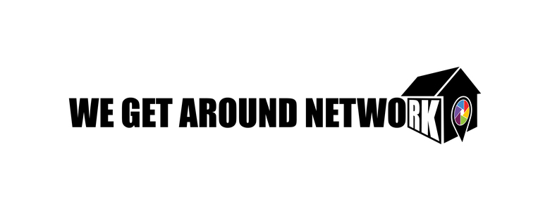 Kimp Design 2 New We Get Around Network Logo: Which one do you like? Hi All, Time for a refresh! Which We Get Around Network logo do you like best? (Why would be a plus!) (I engaged Kimp design agency to help with a We Get Around Network makeover: starting with the logo. Yes! Tall order. But, hang in there!) Thanks, Dan |
||
| Post 1 • IP flag post | ||

|
|
ukvisualimmersion private msg quote post Address this user | |
| I prefer 2 but find both quite large, would be great to see how the brand looks in its shortened form of WGAN as part of the rebrand. We are also rebranding at the moment so shout if you need any help | ||
| Post 3 • IP flag post | ||
|
|
RaeAllenMedia private msg quote post Address this user | |
| I prefer option 1, unless there's a reason to accent the "RK" I do agree with @unvisualimmersion that a shorter version using WGAN as the main logo. Maybe build We Get Around Network as a smaller byline underneath WGAN logo. |
||
| Post 4 • IP flag post | ||

|
BenAdgie private msg quote post Address this user | |
| I like 2. It looks 3D. | ||
| Post 5 • IP flag post | ||
 WGAN Standard WGAN StandardMember Birmingham, Alabama |
rko1 private msg quote post Address this user | |
| Number 1- Agree RaeAllen Media, reason to make the logo larger, reason, more simple but eye catching, makes it rememberable. | ||
| Post 6 • IP flag post | ||
 WGAN WGANStandard Member Chicago |
rzphotoman private msg quote post Address this user | |
| I like #1. See no reason to highlight RK... | ||
| Post 7 • IP flag post | ||
 WGAN Fan WGAN Fan Club Member Portland, Oregon |
HelloPado private msg quote post Address this user | |
| Design 1. I'd also like to see a shorter companion logo as mentioned above. |
||
| Post 8 • IP flag post | ||

|
misho73 private msg quote post Address this user | |
| #1 for sure | ||
| Post 9 • IP flag post | ||
 WGAN Standard WGAN StandardMember Las Vegas |
VTLV private msg quote post Address this user | |
How about making the logo more iconic and squared up? Put WGA off the side of the 3D effect house and fill in the letters "TV" on the side of the house instead of "RK" to hghlight WGAN-TV. Something along this layout. Obviously with different colors and fonts - I got some Cinco De Mayo to get to.  |
||
| Post 10 • IP flag post | ||

|
WGAN Standard Member Birmingham, Alabama |
rko1 private msg quote post Address this user | |
| Why not just put all of the WGAN as part of the house which just simplifies it. Then you truly have a smaller logo with 3D. | ||
| Post 12 • IP flag post | ||
 WGAN Fan WGAN FanClub Member Queensland, Australia |
Wingman private msg quote post Address this user | |
| I personally like the 1st one but I think people are right saying you will also need a small format logo. | ||
| Post 13 • IP flag post | ||

|
jpierce360 private msg quote post Address this user | |
| 2 | ||
| Post 14 • IP flag post | ||

|
TakedaSan private msg quote post Address this user | |
| Hi @DanSmigrod, Based on the other comments I just took some minutes to help you.  Takeda IMG360.com.br |
||
| Post 15 • IP flag post | ||
|
WGAN Forum Founder & WGAN-TV Podcast Host Atlanta, Georgia |
DanSmigrod private msg quote post Address this user | |
| @kmiller01 @ukvisualimmersion @RaeAllenMedia @BenAdgie @rko1 @HelloPado @misho73 @VTLV @JPPeron @Wingman @jpierce360 @TakedaSan Thank you for your feedback (and patience) while I reply to individual questions/input. Best, Dan |
||
| Post 16 • IP flag post | ||
|
WGAN Forum Founder & WGAN-TV Podcast Host Atlanta, Georgia |
DanSmigrod private msg quote post Address this user | |
Quote:Originally Posted by @RaeAllenMedia Quote: Originally Posted by @VTLV 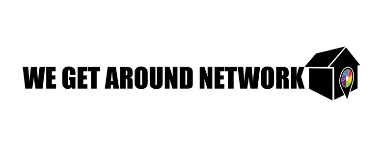 Kimp Design 2A 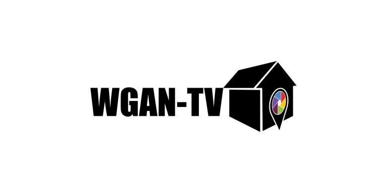 Kimp Design 2B 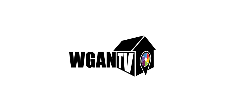 Kimp Design 2C @RaeAllenMedia Thank you for the comments. There is no reason to accent the "RK" (other than the emphasis on 3D by "wrapping" the test around the building. Do you like Kimp Design 2A better? We also wrapped the text in Kimp Design 1 because we did in the WGAN-TV version (Kimp Design 2C) which I did not previously share. If you prefer Kimp Design 2B better than Kimp Design 2; do you prefer the same implementation for WGAN-TV (Kimp Design 2B or including "TV" in the "wrap" around the building in Kimp Design 2C? @TakedaSan [much, much thanks] did a great job showing a "smaller" implementation. Quote: Originally Posted by @TakedaSan When looking at @TakedaSan's three versions, do you like the original, the second one over or the far right? Here are just the logos:  Kimp Design 1A 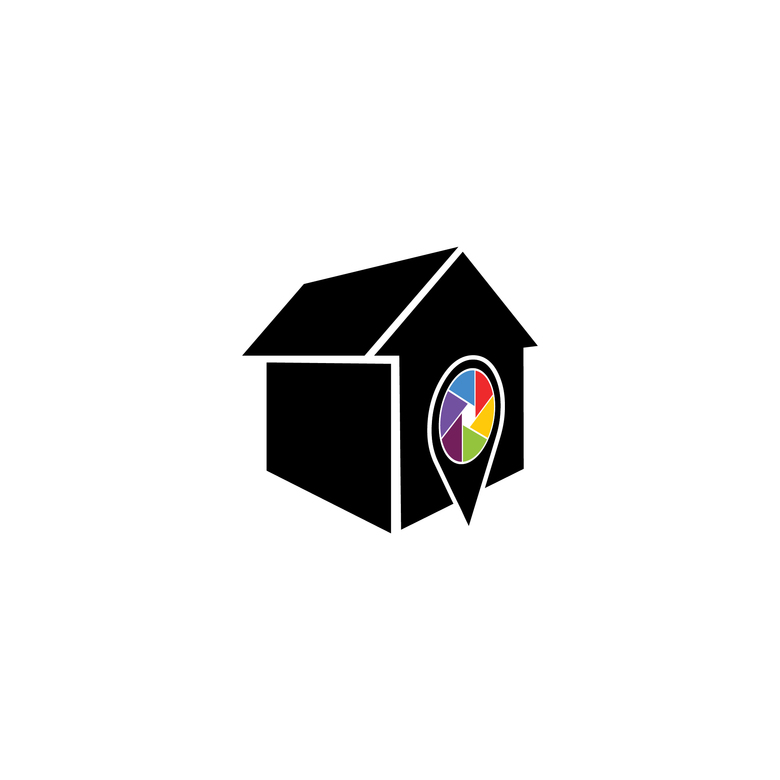 Kimp Design 2D @VTLV Do you like the "TV" in in version 2C? (And, thanks for your mock-up!) Happy Cinco De Mayo! Dan |
||
| Post 17 • IP flag post | ||
|
WGAN Forum Founder & WGAN-TV Podcast Host Atlanta, Georgia |
DanSmigrod private msg quote post Address this user | |
Quote:Originally Posted by @ukvisualimmersion Is this what you had in mind? Quote: Originally Posted by @TakedaSan Or, 2B with - and without the "TV" ..." Kimp Design 2B (Feel free to start a new WGAN Forum discussed to get feedback on your rebranding.) Dan |
||
| Post 18 • IP flag post | ||
|
WGAN Forum Founder & WGAN-TV Podcast Host Atlanta, Georgia |
DanSmigrod private msg quote post Address this user | |
Quote:Originally Posted by @rko1 @rko1 Kimp design 1 (above) is more eye-catching that Kimp design 2 (above)? Dan |
||
| Post 19 • IP flag post | ||
|
WGAN Forum Founder & WGAN-TV Podcast Host Atlanta, Georgia |
DanSmigrod private msg quote post Address this user | |
Quote:Originally Posted by rzphotoman In Kimp design 2A (above), we remove the "TK" from the "building". Do you still prefer Kimp design 1 (above)? Dan |
||
| Post 20 • IP flag post | ||
|
WGAN Forum Founder & WGAN-TV Podcast Host Atlanta, Georgia |
DanSmigrod private msg quote post Address this user | |
Quote:Originally Posted by @HelloPado @HelloPado Is the following what you mean by shorter? Quote: Originally Posted by @TakedaSan If so, got a preference? Dan |
||
| Post 21 • IP flag post | ||
|
WGAN Forum Founder & WGAN-TV Podcast Host Atlanta, Georgia |
DanSmigrod private msg quote post Address this user | |
Quote:Originally Posted by @misho73 @misho73 Why for sure please? Dan |
||
| Post 22 • IP flag post | ||
|
WGAN Forum Founder & WGAN-TV Podcast Host Atlanta, Georgia |
DanSmigrod private msg quote post Address this user | |
Quote:Originally Posted by JPPeron Reason why please? Dan |
||
| Post 23 • IP flag post | ||
|
WGAN Forum Founder & WGAN-TV Podcast Host Atlanta, Georgia |
DanSmigrod private msg quote post Address this user | |
Quote:Originally Posted by @rko1 @rko1 For clarification, put "WGAN" inside of the "building" and remove the photography/location marker? Kimp Design 2C 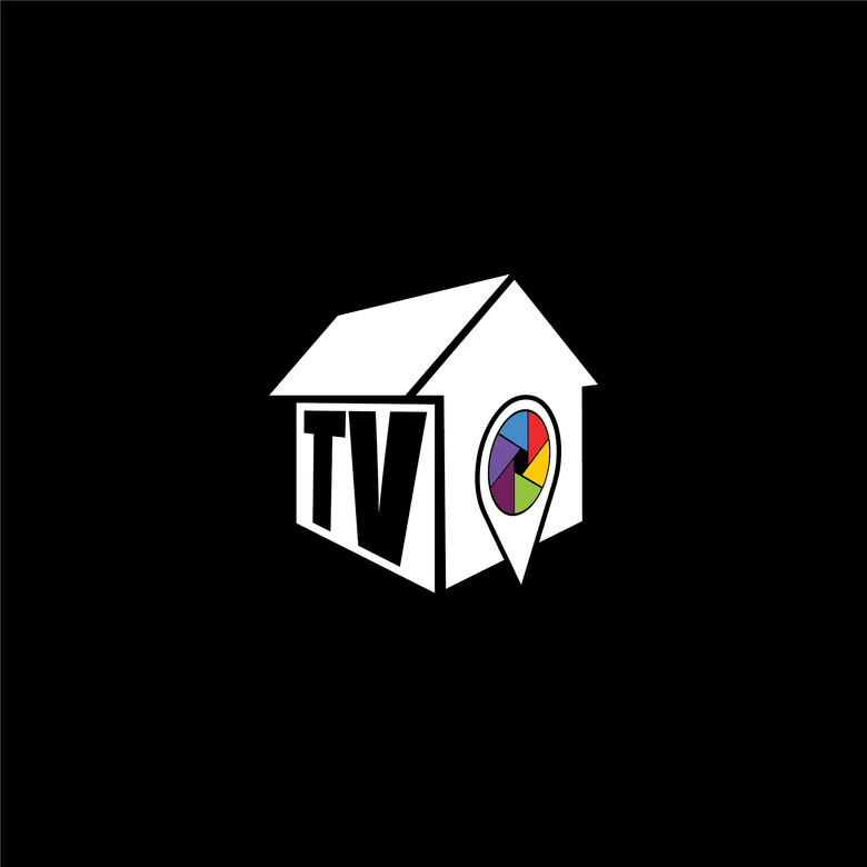 Kimp Design 2E Dan |
||
| Post 24 • IP flag post | ||
|
WGAN Forum Founder & WGAN-TV Podcast Host Atlanta, Georgia |
DanSmigrod private msg quote post Address this user | |
Quote:Originally Posted by @Wingman @Wingman Can you tell me why you like Kimp Design 1 (First one at the beginning of the discussion.) Also, is this what you mean by "small format logo"? Quote: Originally Posted by @TakedaSan Dan |
||
| Post 25 • IP flag post | ||
|
WGAN Forum Founder & WGAN-TV Podcast Host Atlanta, Georgia |
DanSmigrod private msg quote post Address this user | |
Quote:Originally Posted by @jpierce360 @jpierce360 Can you tell me why you like #2 versus #1? Dan |
||
| Post 26 • IP flag post | ||
|
WGAN Forum Founder & WGAN-TV Podcast Host Atlanta, Georgia |
DanSmigrod private msg quote post Address this user | |
Quote:Originally Posted by @TakedaSan @TakedaSan Thanks SO much! That's awesome! Now you will make it even harder to decide! (A good problem.) Dan |
||
| Post 27 • IP flag post | ||
|
WGAN Forum Founder & WGAN-TV Podcast Host Atlanta, Georgia |
DanSmigrod private msg quote post Address this user | |
| Hi All, I am torn between which Kimp designed logo. I was hoping for a clear winner. Others that want to weigh-in? Best, Dan |
||
| Post 28 • IP flag post | ||
|
|
TakedaSan private msg quote post Address this user | |
| @DanSmigrod, You help us a lot with the forum content. It was a form of gratitude. Now I will leave the decision to you and the forum members. I don't want to complicate things further. Kkkkk Takeda |
||
| Post 29 • IP flag post | ||

Frisco, Texas |
Metroplex360 private msg quote post Address this user | |
| I like the old one better. It's cleaner and one thing we know about logos is that modern logo design doesn't use gradients and keeps it very basic when it comes to color choices. The old logo has symbolism that matches the concept of getting around whereas the new one has a shed |
||
| Post 30 • IP flag post | ||
This topic is archived. Start new topic?